2017
ACTALIA•REBRANDING
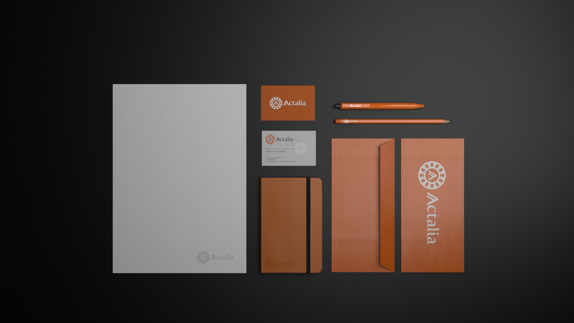
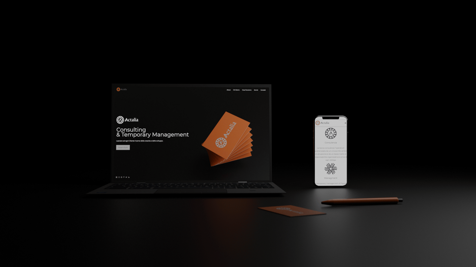
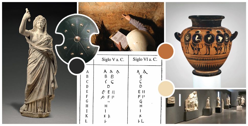
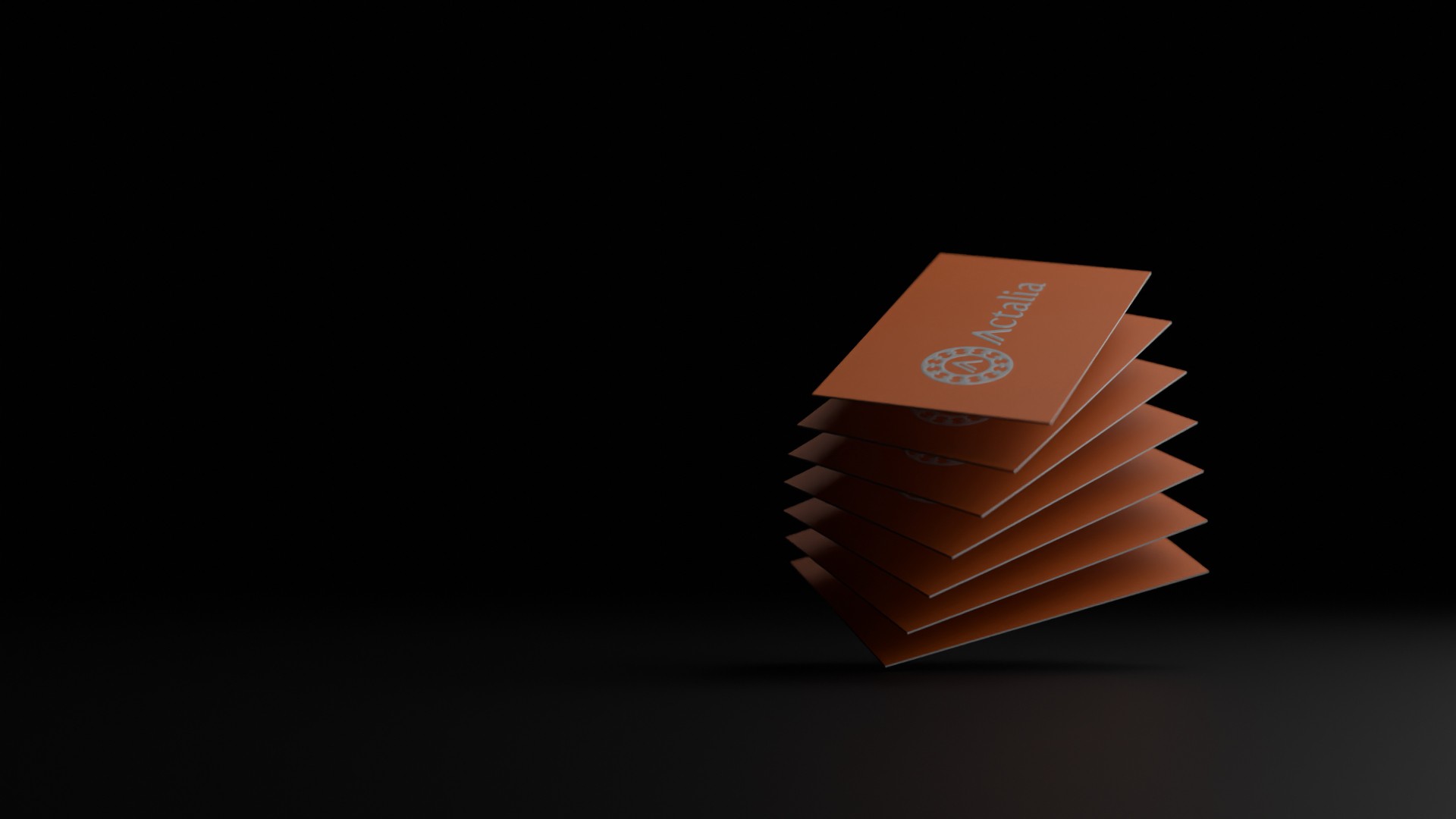
Actalia specialises in business consultancy, focused on cultural events, archaeology and tourism. The offices are based in Rome, and the commissioner I was liaising with wanted to have deep references of ancient Rome, something that was giving the look and feel of Roman archaeology. After a few proposals, I understood that I was dealing with very knowledgeable clients, therefore I had to come up with something quite niche to impress them. I thought up this aesthetically simple design, but its meaning got their attention. It represents a Roman clipeus, a ceremonial shield adorned with the twelve ancilia - sacred shields used by the Salii brothers during rituals of ancient Rome. In the middle is the letter a of the ancient Roman “cursive” alphabet.
They loved it.
BRANDING
VISUAL IDENTITY
